Showing posts with label swatches. Show all posts

Friday, 13 April 2012

Swatches: Revlon Lip Butters

It's been a while since I blogged - and I've got a really good reason! Actually, it's because the hubby and I just found out that we're going to have a baby! 

How awesome is that!

It's early days yet, but we can't wait to take this journey together, and every day is a new experience for us. We've just been busy documenting every moment so we don't miss anything. Soon there'll be a little baby clock running around!

Right now, the little baby is making me exhausted though - I usually feel like I need a nap halfway through the day - and I usually end up KO-ing on the bed once I'm back home. There's not much time to do very much else, and that's why I've been falling behind on my blogging. There's a whole backlog of stuff that I have to get posted! :3

I hope everyone has been well! Share your news with me!


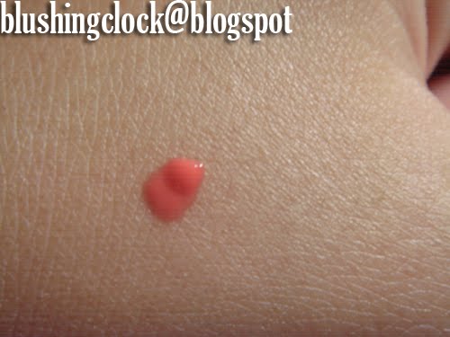
Anyway, I'm sure we're one of the last people on Earth to get these, but Revlon Lip Butters have finally landed in Singapore! I passed by a standee the other day, and caught sight of the gorgeous Emma Stone modelling Peach Parfait, which looked lovely on her. They go for S$15.90 in Singapore, which is quite a lot more than the US$6 or so that they cost in the US. Anyhoo, only 8 shades have been released here so far, and I got some swatches:


Sorry about the mark on my hand - I burned myself with the steamer - there's still a mark there! T__T These are relatively heavy-handed swatches, but I found that the lip butters swatch fairly true to colour and have a great deal more moisture (at least when applied) than your average lip gloss. They didn't last a very long time, because they wiped off my hand easily and came off pretty quickly when I used the one that I bought (below), but I think I can live with the lack of longevity for the cute pop of colour, vanilla scent and smooth, buttery feel.


I have to admit that I was tempted by all the colours, but in the end I went for a colour that I could use at work without appearing too scary or "made-up". Macaroon is a lovely coral, peachy colour, that is easily buildable and applies so smoothly on my lips. I think that for my complexion, it's a "my lips, only better" kind of shade, that I'll definitely be able to hold on to. 

I was also gifted the Strawberry Shortcake by the lovely PrettyShinyThings, which was a nice surprise to find! I haven't had the heart to use it yet (I've been keeping things for special), but I'm intending to break it open for a whirl soon enough! 

Keep well everyone, and happy weekend! ♥

Wednesday, 11 January 2012

Haul + Review: Benefit Georgia and Posietint + Swatches

Recently I got my hands on Benefit's Posietint and (the now-discontinued) Georgia from an online seller. The whole shebang came brand new and packed, albeit a little precariously, in a medium-sized envelope. 


See what I mean? A little bit dog-eared, but since the contents were safe and sound, no harm done. When I got the package undone, this was what I received: 


The seller kindly gave me a free green tea mask in addition to my purchases. Result! 


Benefit claims that Posietint is a "poppy-pink tinted lip and cheek stain", that provides a "kiss of see-through" colour to "brighten cheeks & lips". Its "liquid-gel formula blends to just-picked perfection on all complexions and lasts for hours". 

The description sounded lovely enough to me, so I decided to give it a whirl. I already use Benefit Benetint (and have some UK drugstore alternative as well) - the consistency of which I love - so I figured this might be a pinker version of that. 


What I loved: 

It definitely lends a pinker, cuter pop of colour to the skin (although I didn't really get the poppy reference - I always thought poppies were red), and thankfully it is translucent enough to stand out just right on both tan and dark skin. 

I tried this out on the back of my hand, which was suitably tanner thanks to a week out in the sunshine and it still stood out, which was great because on tanned Asian skin, lighter blushes - especially those loaded with more glitter than pigment - tend to just disappear into the skin. So this was great for that. Plus, it lends a flushed look that is more natural and less severe than Benetint.
 
What I didn't love: 

The consistency. The Posietint formula seems gloopier than Benetint. Where Benetint has a light, watery consistency, Posietint has a thicker, more opaque look to it. Perhaps it has to do with the pink colour pigments, but it applied almost opaque on my hand (as seen in the above photos). 

I think the consistency might be its one drawback though, and should be applied by make-up novices with care, as gloopy make-up tends to apply unevenly, giving that quite awful racing stripe look.That said, I feel that I should give Posietint one more chance, because it is equally likely that the product dried unevenly when I paused to take the above photos. 

Nevertheless, Posietint is good as a base for creating a denser, pink cheeked look, or on its own for a natural, healthy flush. If applied with care, the result can be good!


Georgia

Georgia was discontinued by Benefit in early 2011 due to (I assume) poor sales. To be honest, I never dallied very long by Georgia at the Benefit counters when choosing blushers. This was purely because there were so many other options on offer - Coralista, Sugarbomb, Bella Bamba... amongst the myriad shades and concoctions, Georgia very easily got ignored. 

The funny thing with Benefit is that they call all their blusher-type things "face powders", which is suitably ambiguous. This includes bronzers (Hoola, Dallas), blushes (Coralista, Sugarbomb), and those that are neither (Georgia, and at a push, Dandelion). In fact, you'd probably be forgiven for getting one or the other confused. 


As you can see from the swatches above, Georgia is warm-toned, peachy in colour, and would do perfectly as a finishing/pressed face powder. 

What I loved: 

It's a lovely colour, and applies nicely to give good coverage all over the face. I like how it's just a little bit pigmented, and I felt that it evened out my skin tone and giving me just a little bit of a healthy glow - peachy, almost - pun intended!

What I didn't love: 

The packaging. Benefit face powders are all packaged in these little square cardboard boxes and come with the characteristic little square brushes. These are great for blushers, where you need to pack on colour for a small area - the brushes work excellently to pick up and transfer colour where it is needed. However, using the same brush (and surface area) on the whole face severely limits application. I switched the square brush out for a normal retractable brush (mine is from the Body Shop), and the powder went on like a dream. 

Do you use Benefit products? Which ones are your favourites?

Friday, 2 December 2011

Haul + Review: Paul & Joe Fall 2011 Collection - "Manhattan" + Swatches

I'd like to share a couple of eyeshadows that have been on heavy rotation for me of late. They're from the Paul & Joe Fall 2011 Limited Edition Manhattan Collection, and are named and inspired by none other than the Big Apple - New York City.


Featuring an undeniably chic chequered design, each eyeshadow pot consists of two complementary colours, and are fashionably named (in the below image from left): Brooklyn Bridge, Empire State, and 42nd Street. The only gripe that I had in relation to the packaging of the shadows was that they can get a little bit fiddly to use, when trying to pick up colour, thanks to the criss-cross design. This can be easily rectified though, with a sponge eyeshadow applicator or eyeshadow brush. If the colours do end up mixing, a quick blow will get rid of any loose bits of eyeshadow - hey presto!

I love the sleek packaging of the shadows, and the pretty prints that, as always, are prints from Paul & Joe's catwalk collection. Paul & Joe eyeshadows offer a soft wash of colour, which is really pretty and subtle, so when I saw the colour combinations for the Manhattan collection, I had to get them. It took a while of collecting and watching out for bargains, but I managed it in the end ^~^


The eyeshadows can be popped out (see below), by sticking a paper clip or similar pointy item into the hole on the back of the pot, and are interchangeable with any other Paul & Joe Face & Eye Color CS shadow. I call them eyeshadows, though they are technically okay to use on the face as well. (I'm guessing cheeks). That said, the lighter shades would do beautifully as a highlighting powder for cheeks and nose bridges - even decollete, if you so choose!


Brooklyn Bridge

Named after one of the oldest suspension bridges in America, Brooklyn Bridge is a really pretty combination of two pinks - a golden, dusty rose, and shimmery baby pink, that are really adorable together. I really love the darker shade just at the outer corners of my eye for giving depth, and the lighter shade for highlighting. Both colours carry a little shimmer, which give a sheer wash of colour to the whole eyelid when used together. I like to think the two shades can help create a dreamy look, like watching a sunset from the Brooklyn Bridge!


Swatch: Under natural light


Empire State

This duo consists of a sheeny, shiny light gold colour twinned with a dark, matte navy blue/black shade. I like how the colours are subtle enough to wear to work, but can be built up to add a bit of sparkle after office hours. The dark shade is good for use as an eyeliner, though you'll probably need a good liner brush that will pick up a good bit of shadow. As you can see in the swatch below, the darker shade can end up looking a bit patchy, as I swatched without using primer, and had to pat on the colour a good four times to get that swatch. Like the Empire State Building, these colours are reminiscent of the roaring '20s and Art Deco, and can be used to recreate the graphic, dramatic eye make-up of ladies during that period, like so:


Swatch: Under natural light


42nd Street

This was tough to capture on-camera. The shades are a light pink - not as light as the pink in Brooklyn Bridge (above), with pink glitter, and a twilight blue shade with blue glitter. The shadow is named after 42nd Street in downtown New York, right near the famous Times Square. I like how vibrant and buildable the two colours are, and when combined, create a shimmery eye that is just lovely. The sparkliness of the colours meant that the shadows didn't photograph very well, but they are definitely worth a look.


Swatch: Under natural light


As the colours are limited edition, this collection will soon be retired (if this hasn't already happened) , to give way to the Holiday 2011 and Spring 2012 collections. These are easy-to-use colours that will see you through the seasons, so if you come across them, it would be a shame to pass them up. Empire State can still be purchased here for £8.95. Since each pot retailed initially at £15 each, it's quite the bargain!